Winbet Web App
I redesigned the sportsbook web platform to improve user navigation, simplify betting interactions, and create a scalable design system that supports a growing number of sports, markets, and user journeys.
Client
Convex Technology
Role
Product Designer
Tools Used
Figma, Adobe illustrator
Year
Jan 2023
Background
Winbet is a digital sportbook and casino games platform provider that allows users to explore sports events, view odds, and place bets through a web-based experience.
The problem
The sportsbook platform's core functionality was solid,
but its interface hadn't been refreshed in years and no longer met modern
standards — reducing clarity and making it feel less engaging than contemporary
betting products.
The redesign focused on modernizing the interface while preserving
familiar workflows, so existing users could transition comfortably
while new users got a more intuitive, visually appealing experience.
Challenges
The biggest challenge was redesigning a product with an established user base. A full overhaul risked alienating loyal users, while minor tweaks wouldn't shake the product's outdated feel. The goal was to modernize the experience without usability or breaking familiar workflows.
UI Audit
I began by reviewing the existing interface to identify areas that no longer aligned with modern design standards.


What to deal with next ?
I have now understood that I have to Establish a modern visual language, Improve information hierarchy and readability, Standardize reusable UI components, Introduce consistent spacing and typography, Enhance the overall visual quality while preserving familiar user workflows.
Wireframe
Before moving into high-fidelity designs, I created low-fidelity wireframes to refine the layout and improve the visual hierarchy of key screens. This allowed me to focus on content structure, spacing, and component placement without being distracted by visual styling.


Design System

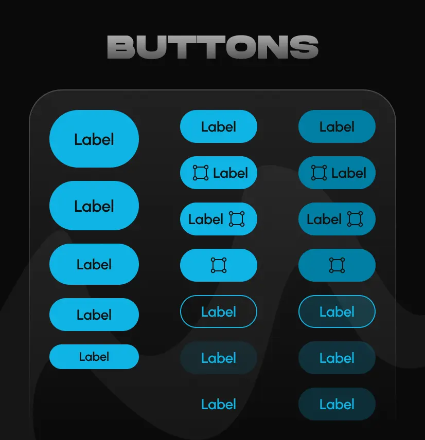
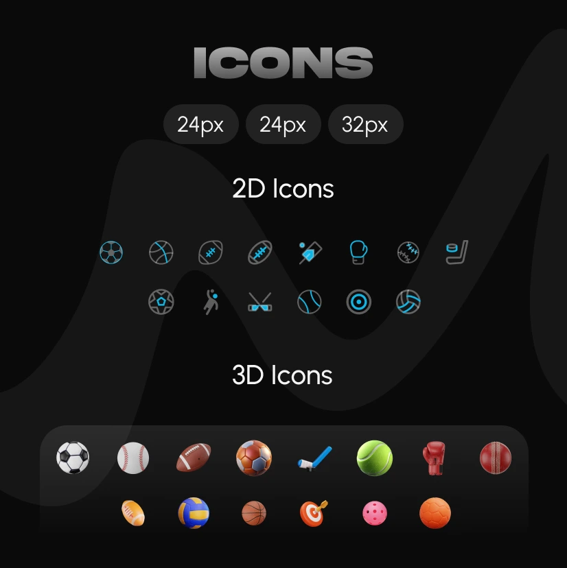

Solution
The redesigned interface introduces a cleaner, more consistent visual language that enhances readability, improves visual hierarchy, and creates a cohesive user experience while maintaining familiar navigation patterns for existing users.


Before & After
The redesign focused on modernizing the platform's visual language while preserving familiar user interactions. The comparisons below highlight key improvements across the most important screens.


Lesson Learned
Time Management
With only a month to design and implement the project, I focused on managing my time effectively. Staying organized and goal-driven helped keep the process smooth and ensured a successful delivery.
Stick to the Objective
User insights sparked numerous ideas for improvement, but with limited time, I had to stay focused on the core objective to ensure a clear and effective outcome.