Sabi Job marketplace
A complete redesign of Sabi's digital ecosystem, creating a cohesive experience for both employers and job seekers.
Client
Sabi Works
Role
UI/UX Designer
Tools Used
Figma, Adobe illustrator, Slack
Year
Apr 2024
Background
Sabi is a talent acquisition platform that connects businesses with pre-vetted African technology professionals.
The problem
The platform was held back by a fragmented digital ecosystem, creating a
jarring,
inconsistent experience as users transitioned from the public marketing site into the core product
environment.
This friction was driven by an outdated visual identity and an interface where reusable components
completely lacked consistency.
Without unified standards, the platform suffered from severe, limited scalability, turning every
new feature deployment into a costly
design and engineering bottleneck.
Challenges
Redesigning a multi-sided platform required balancing the needs of two primary user groups—employers and job seekers—while maintaining a consistent brand experience across both the public website and authenticated product interfaces.
Competitive Analysis
To better understand the market and identify opportunities for improvement, I analyzed competing job platforms with major metrics and dropped couple of points down here.

Personas
Based on the project's goals and target audience, I created user personas to represent the needs, motivations, and pain points of both job seekers and employers. These personas helped guide design decisions, ensuring the experience addressed real user expectations while supporting the platform's business objectives.

Wireframes


Solution

The Home Page
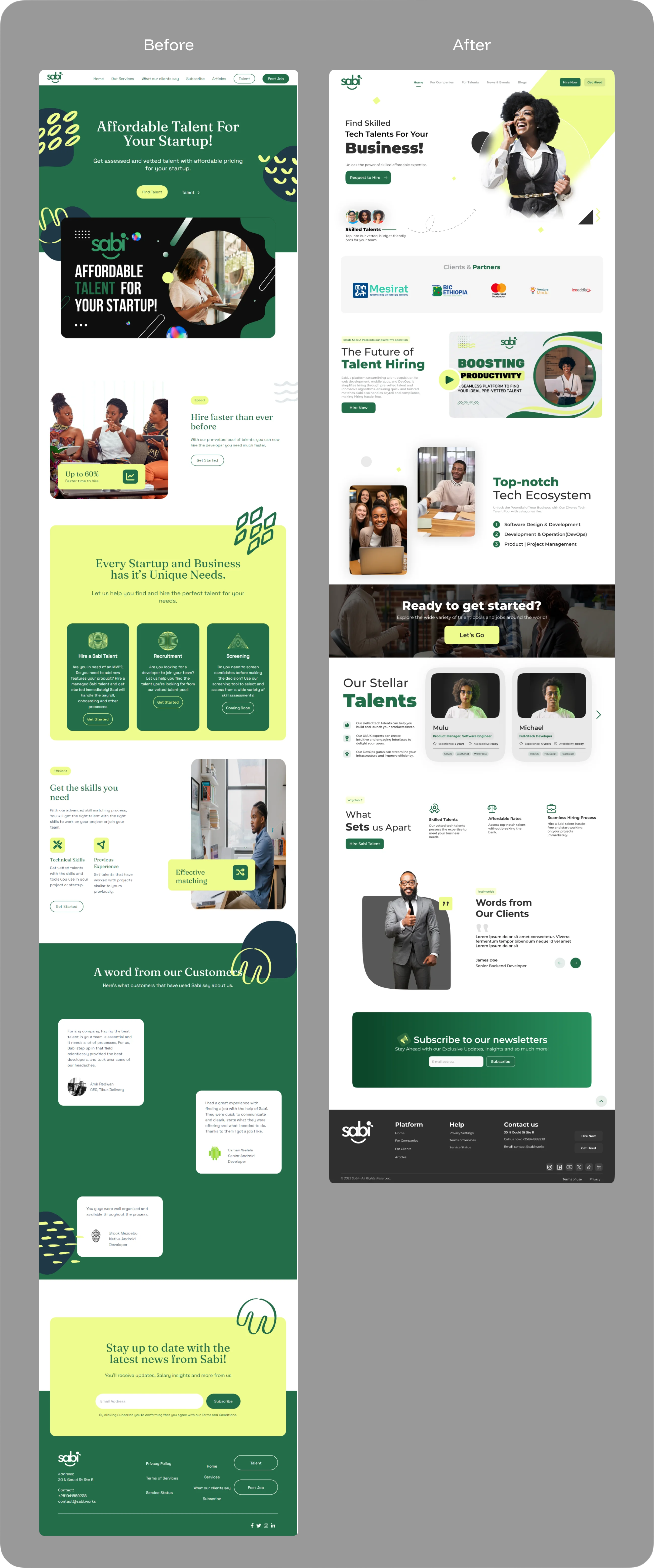
WHAT I DID - I removed the unnecessary vectors, shapes and heavy colors that were used as a background, foreground and component presets. Replaced it with elevating assets, more white spaces, and better structure with solid arrangements.
Before
You can scroll through the animated mockup.

After
The home page after the redesign.

Job Seekers - Talent
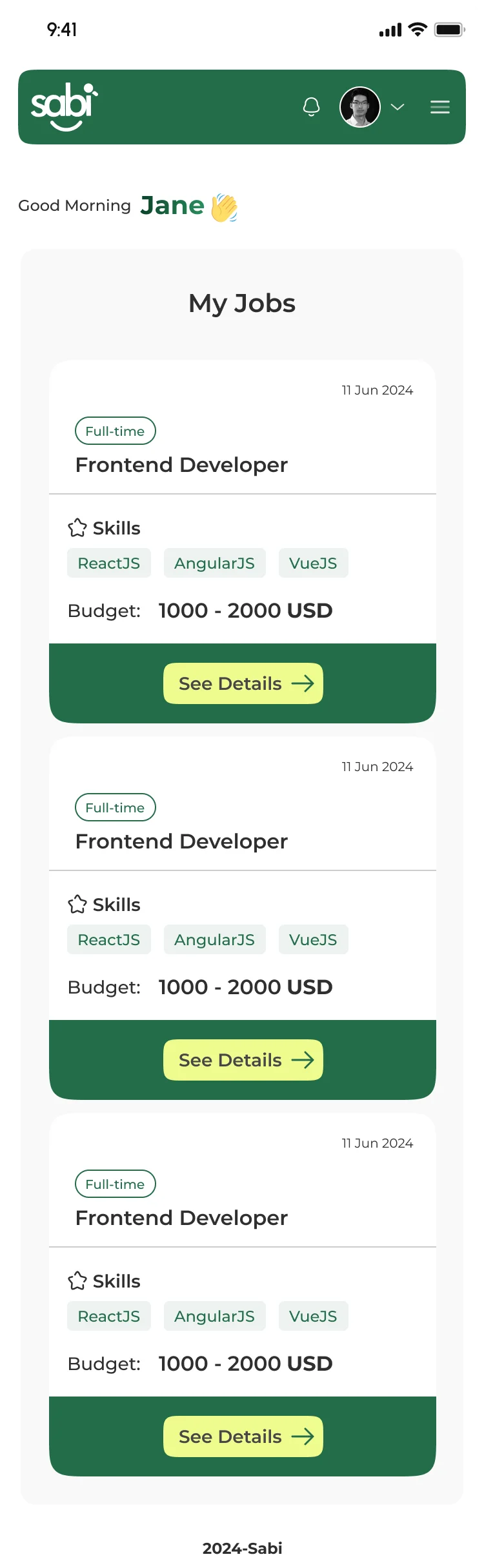
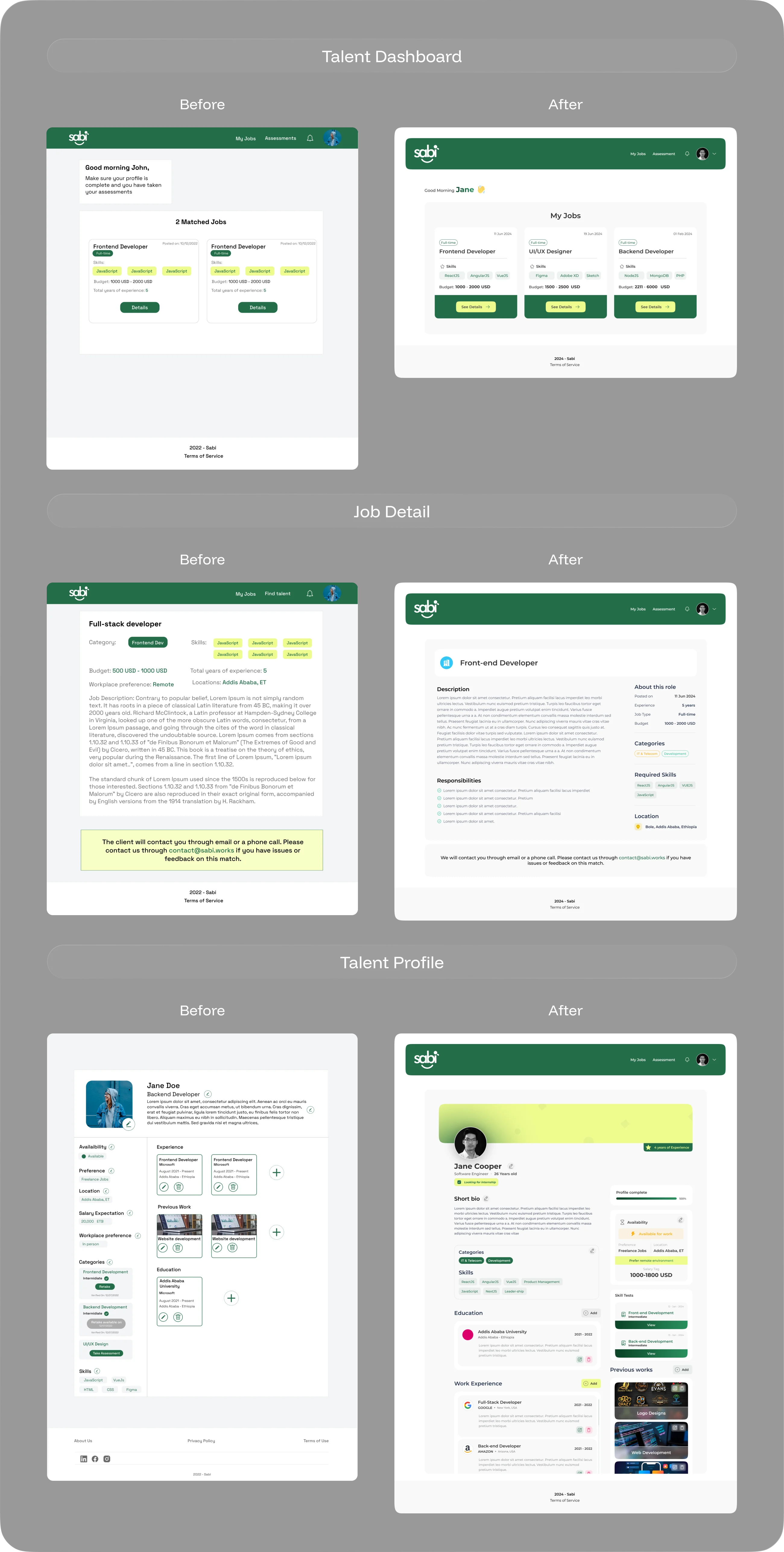
WHAT I DID - Major changes done on the Talent side is totally changing the each component is represented and shown. Introducing 3d assets, new typeface for headlines and body, clean frames. And Precisely, using the brand colors in fair-touch.
Before
You can scroll through the animated mockup.
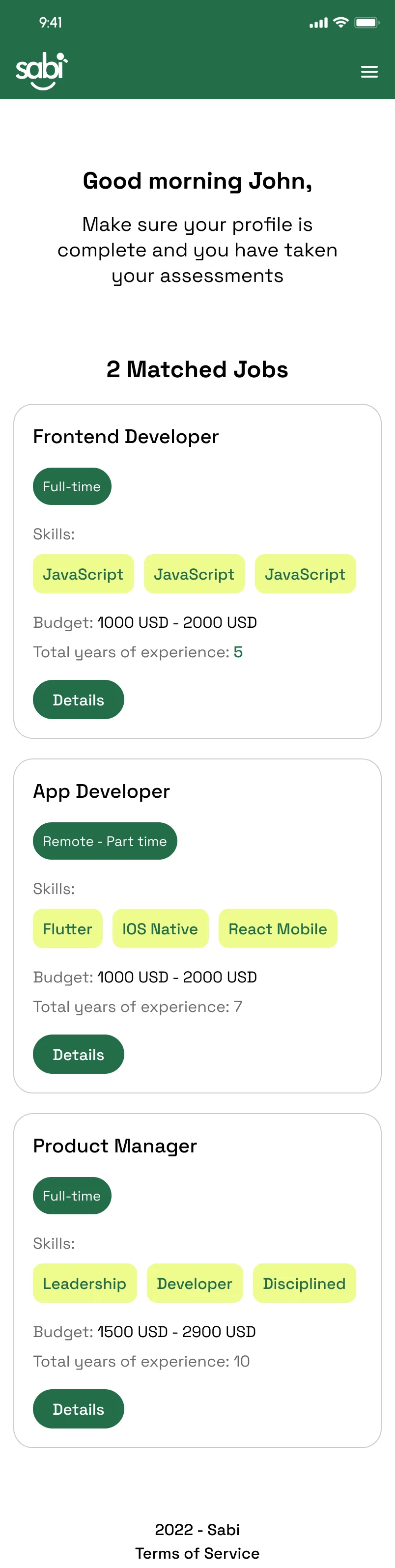
After
The talent dashboard after the redesign.
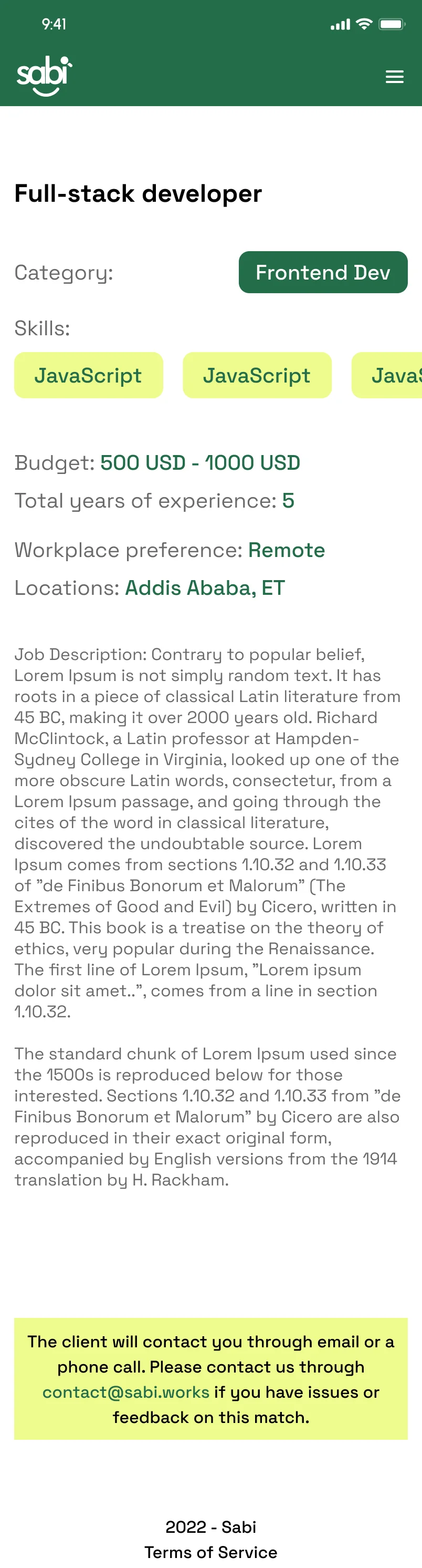
Before
The job detail before the redesign
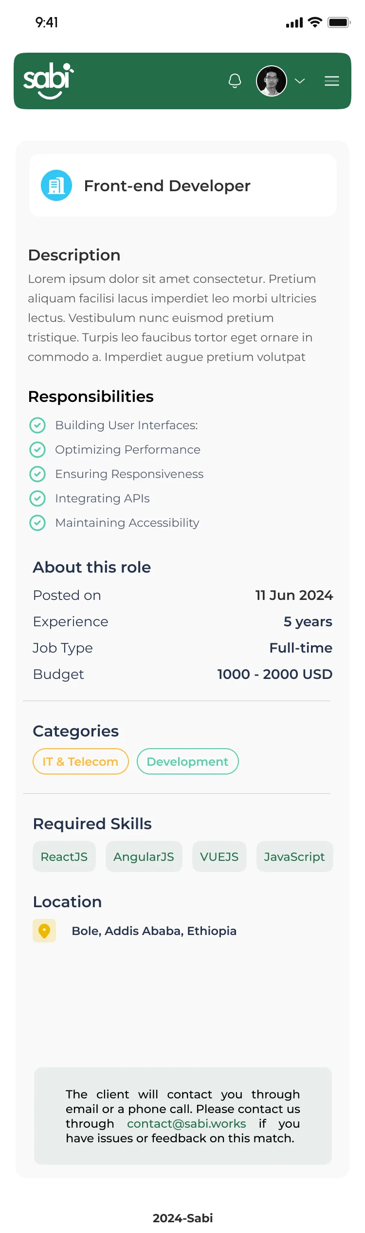
After
The job detail after the redesign.
Before
The talent profile before the redesign

After
The jtalent profile after the redesign.

Client - Employers
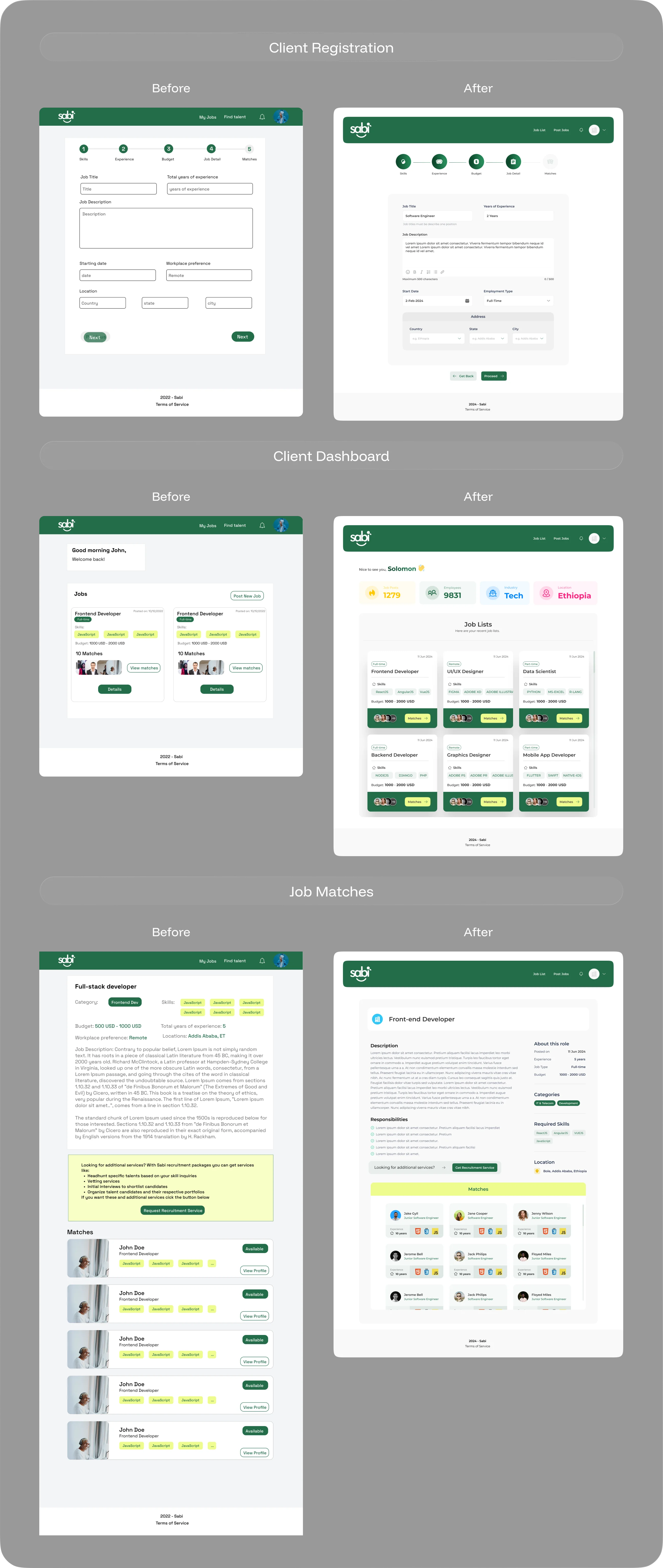
WHAT I DID - Pretty much identical to talent side. The major leap from the old was components are re-arranged and enhanced in a way that it matches the rest of the designs.
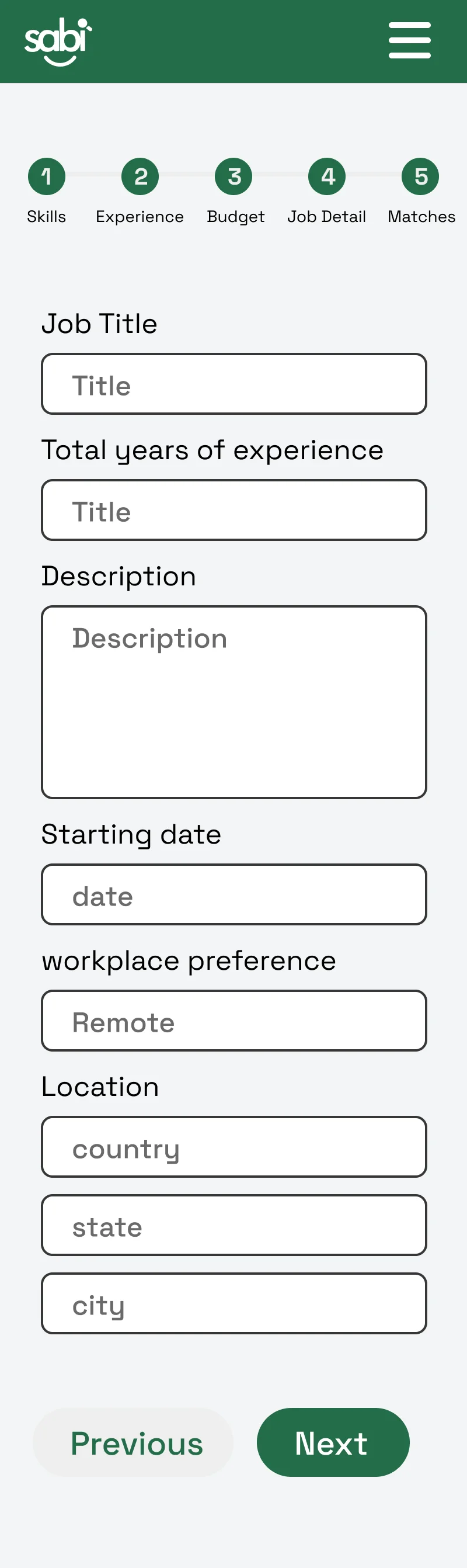
Before
Client registration before the redesign.
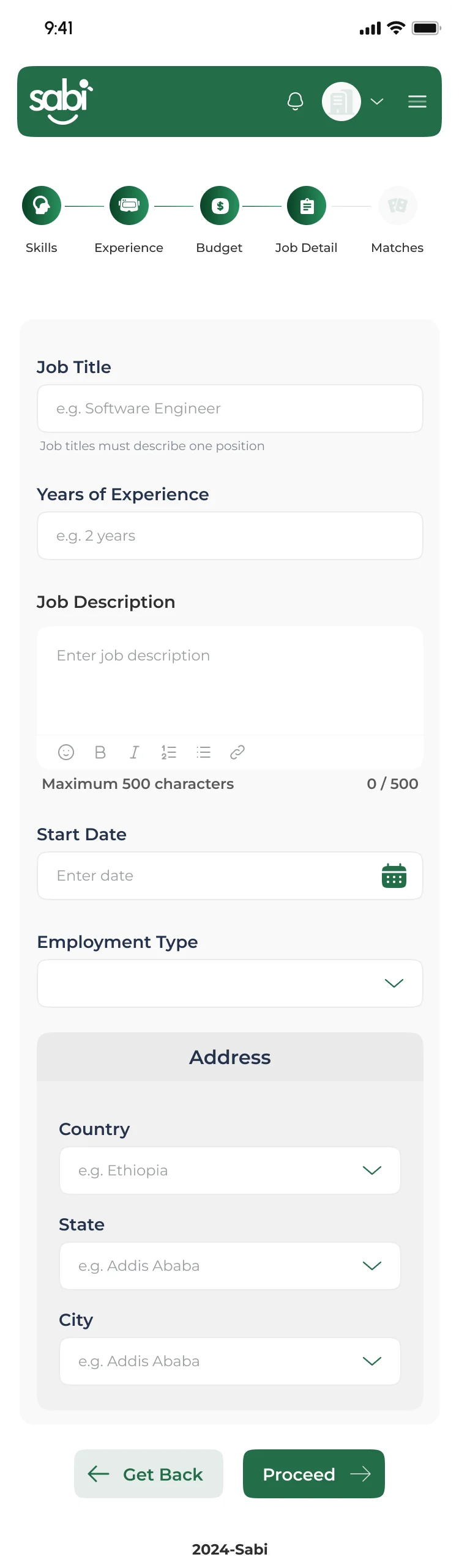
After
Client registration after the redesign.
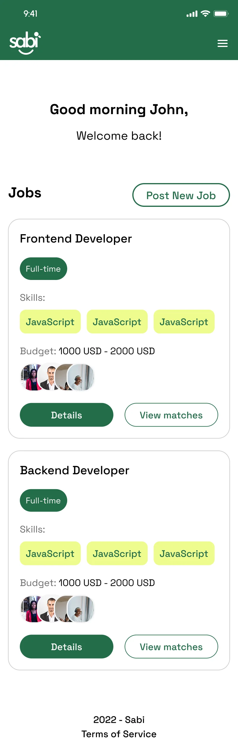
Before
Client dashboard before the redesign.
After
Client dashboard after the redesign.
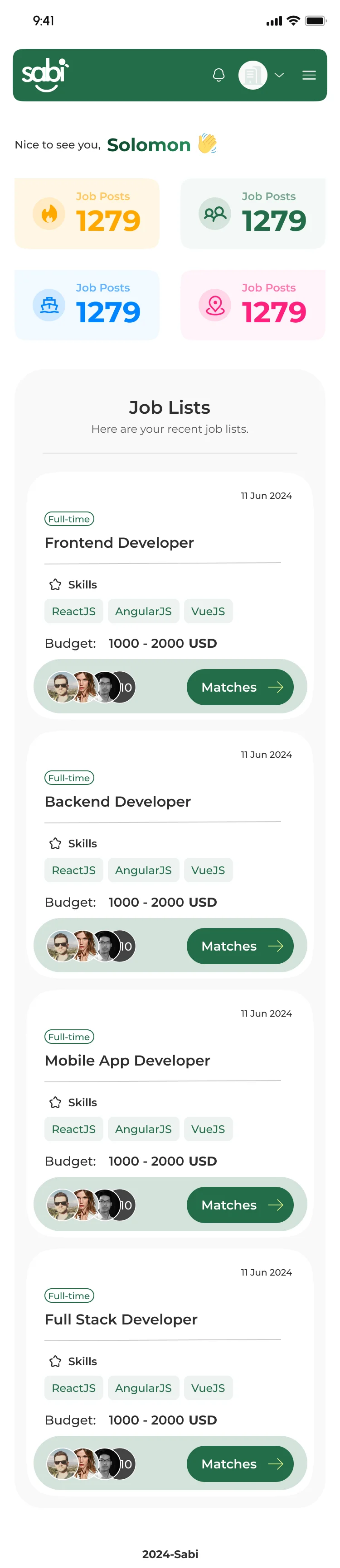
What I did
- Added statistical information at the beginning, So the client can see their real-time status at a glance
- Elevated every container and frames with the brand color
- Used round and curvy components to enhance aesthetics
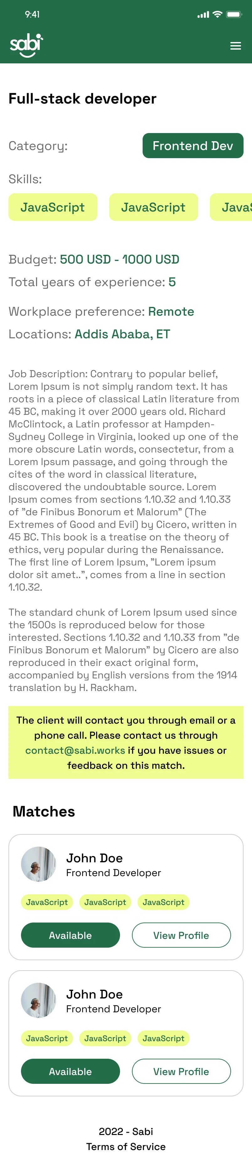
Before
Job matches before the redesign.
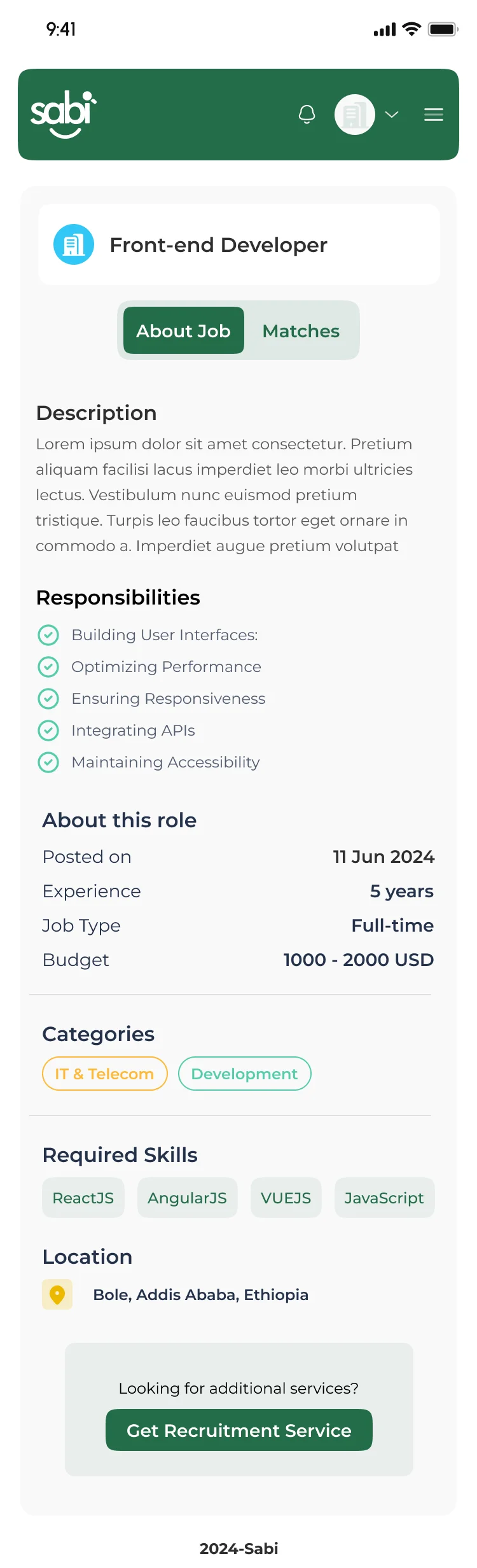
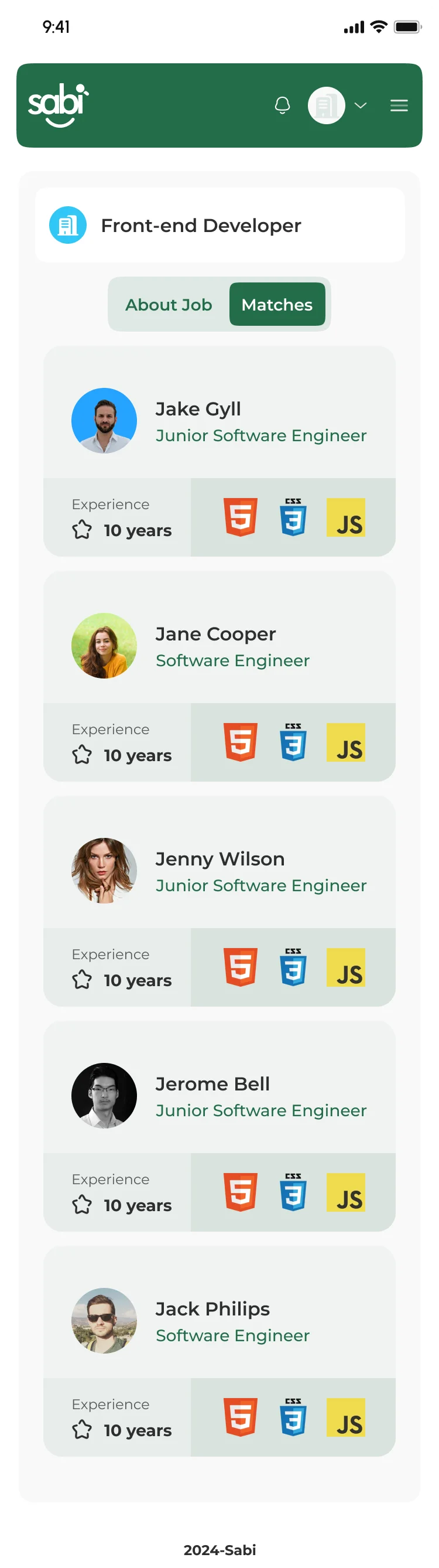
After
Job matches after the redesign.
What I did
- Added a toggle menu so that they can switch between job description and matches.
- Removed unnecessary color contrast issues spacially on the bottom part.
- Rearranged the information shown matches card.
Outcome/ Impact
The redesign delivers a more intuitive and engaging experience by improving navigation, strengthening visual hierarchy, and streamlining the job discovery process. The new design establishes a modern, scalable foundation that better serves both job seekers and employers.
Lesson Learned
Balance
This project reinforced the importance of balancing business goals with user needs. I learned how thoughtful information architecture, consistent design systems, and iterative feedback contribute to creating intuitive digital experiences.
Clarity
A successful redesign is not about adding more features, but about making existing experiences simpler and more meaningful. This project reinforced the importance of prioritizing user needs, reducing friction, and creating interfaces that guide users naturally through their journey